
BRAND GUIDE
A truly immersive brand experience

Our goal is simple—wherever our brand walks, consistent design and voice should follow. Immersed in this page, you’ll find the standards that define our visual identity, our voice, and the premium service we deliver.
Licensees, employees, partners, vendors, press, and contributing entities should use this guide to create work that feels real, genuine, and unmistakably Walk Your Plans.
The Brand Strategy
Walk Your Plans is a premium, full-scale walkthrough experience that uses cutting-edge technology to bring your floor plans to life … before you build.
By combining accuracy, innovation, and a little bit of excitement, we’ll help you design and visualize with confidence long before your construction begins.
Our Value Proposition
Immersive Walkthroughs, Designed to Move You
Our Value Prop helps differentiate our brand and make our company meaningful and memorable to our customers.
Each word is unique, precise, and intentional to communicate the value of our people, solutions and service:
“Immersive Walkthroughs” means that it’s not just a blueprint, it’s a physical experience to help you feel your plans.
“Designed” means we’re providing a precise, and custom, experience with detailed layouts in a curated, premium environment.
“To Move You” is where the magic happens and means you’re seeing your future and your designs come to life in real time.
At Walk Your Plans, we don’t just let you ‘see’ your future space, we let you ‘experience’ it and understand it—so you can make confident choices and move your project forward with absolute clarity.

Our Identity
Every experience begins with a first step, which leads to a first impression. At Walk Your Plans, our visual identity sets the tone for the immersive, full-scale moments we create. What follows is a clear and concise explanation of our brand elements—and how we want to be seen:
Primary Logo
The Walk Your Plans primary logo represents the full experience and value we promise to deliver to our customers and their clients. It is made up of our “welcome mat” tile and our wordmark horizontally aligned. This primary mark should be included in all publications and communications. The primary logo should never be reproduced smaller than 1.5” wide or 150 pixels wide.
Clear Space
To ensure the Walk Your Plans logo stands out on all materials and in every digital experience, we must always maintain a clear space around the logo equal to one half the “Y” width. This means that one half the width of the “Y”, relative to the size of logo, is the distance clear around the logo from any other design elements. Using this element of measure allows us to ensure all spacing within, and around, the logo is precise, consistent and intentional.
Reverse Color (aka Dark Mode)
Reverse color represents an alternate to the primary logo that allows the Walk Your Plans logo to stand out on dark colored backgrounds and textures. Always use the logo version that shows the greatest contrast with it that which is behind in any individual instance.
One Color Applications
One Color versions of the Walk Your Plans logo are preferred for instances that require simplicity and separation of color. Such outputs may include printing on promo items, embroidery, sponsorship signs, etc. One Color art is the only version that may be translated to colors outside this brand guide and is reserved for licensee discretion for apparel and location specific branding.
Logo Mark
We like to think of this as our virtual welcome mat. Unique, intentional and true to our business and brand, this badge is the visual representation of who we are. It portrays our immersive experience, innovative technology and our commitment to excellence in the experience of Walk Your Plans. The logo mark may be used on its own when an abreviated logo is required for greatest visibility. Some examples may include, but not limited to, website favicon, apparel, print and digital marketing where the primary logo is also used.
When to use just the “W”
While the “W” line art is striking and memorable, it is but only a partial statement of our brand. With that in mind, we know it’s a great design element and can be used on its own in certain instances. It is recommended that the “W” art be used where the primary mark is not necessary such as background texture or as a design element for merchandise. It is the only art/design that can be cropped and rotated.
Primary Brand Colors
Consistency with color is paramount in preserving the integrity of the Walk Your Plans brand. The following color formulas will ensure that our national brand marks stay true in every instance.
Immersive Red
PANTONE 186 C
RGB: R=211 G=47 B=47
CMYK: C=11 M=96 Y=92 K=2
#d32f2f
Confidence Grey
PANTONE COOL GRAY 1 C
RGB: R=224 G=224 B=219
CMYK: C=11 M=8 Y=11 K=0
#E0E0DB
Walking Grey
PANTONE COOL GRAY 11 C
RGB: R=12 G=2 B=12
CMYK: C=68 M=61 Y=60 K=49
#3D3D3D
Techno Black
PANTONE BLACK
RGB: R=12 G=2 B=12
CMYK: C=74 M=67 Y=66 K=85
#0C0C0C
Typography
Our recommended typeface is Roboto, a popular, humanist sans-serif typeface designed that’s optimized for legibility across web, print, and mobile interfaces. It is known for its neutral, friendly appearance, open letterforms, and upright stress, making it easy to read in a variety of applications Above all else, it’s a sophisticated, modern, premium-looking font, that’s both versatile and functional across all platforms.
*Roboto is a free Google Font and can be downloaded here.
Walk Before You Build
Roboto Medium:
Walk Before You Build
Roboto Regular:
Roboto Semibold:
Walk Before You Build
Roboto Italic:
Walk Before You Build
*The Bold attribute may be used for emphasis on words throughout headlines and body text to connect to our brand promise, value proposition or key messages and benefits.
Location Specific Branding
For licensee and location specific branding it is important to align to our national brand with each respective location and market. While each location and market offers their unique characteristics, the intentionality and consistency of our brand across these markets is paramount to our brand recognition and trust. For this reason, our recommended configurations for location adaptation and social representation are as follows:
For Location specific branding:
Measurements and clearspace:
For Location specific social profiles:
Use the full location name below “W”
-or-
For greater readability you can also use your locations popular abbreviation in place of the full location name
If you need help creating your location specific assets contact Andrew DeCrane
Our Voice
It’s no accident that our voice harks back to our Value Proposition. That’s because it captures the essence of who we are as a company and how we talk to everyone that interacts with our brand.
While it’s understood that all writers are different and word choice will vary per audience and situation, use these voice guidelines and recommendations to always ensure you’re on the right (and write) path.
Our Brand Personality
How we talk to our customers is just as important as the experience we are giving them. That’s where our brand personality comes into play.
Making our brand distinct, real, relevant, and engaging, these five traits guide how we speak, write, and show up across every touchpoint. Use them in your writing to guide our voice, tone, and attitude in all communications.
-
Empowering customers to make confident decisions
Our voice guides, supports, and reassures in simple and informative way—always focused on making the journey smoother for our clients. We turn technical into understandable, cutting through through confusion with simplicity and precision—even for the most complex of topics.
-
Offering customers a white-glove experience
Everything we say should feel polished, premium, and purposeful reflecting the elevated experience we offer our clients.
-
Highlighting the excitement of a dream come true
Stepping into a future space is a milestone worth celebrating. Our voice should capture a joyful, enthusiastic, and energetic tone that feels like an event.
-
Making complex decisions feel comfortable
Our voice should be friendly, warm and welcoming—drawing people in and helping them feel at ease. Whether someone is building their first home or managing a large development project.
-
Helping push the industry forward
As the future of immersive design, our voice should reflect innovation, curiosity, and forward momentum—avoiding dated references, stagnant language, and DIY clichés.
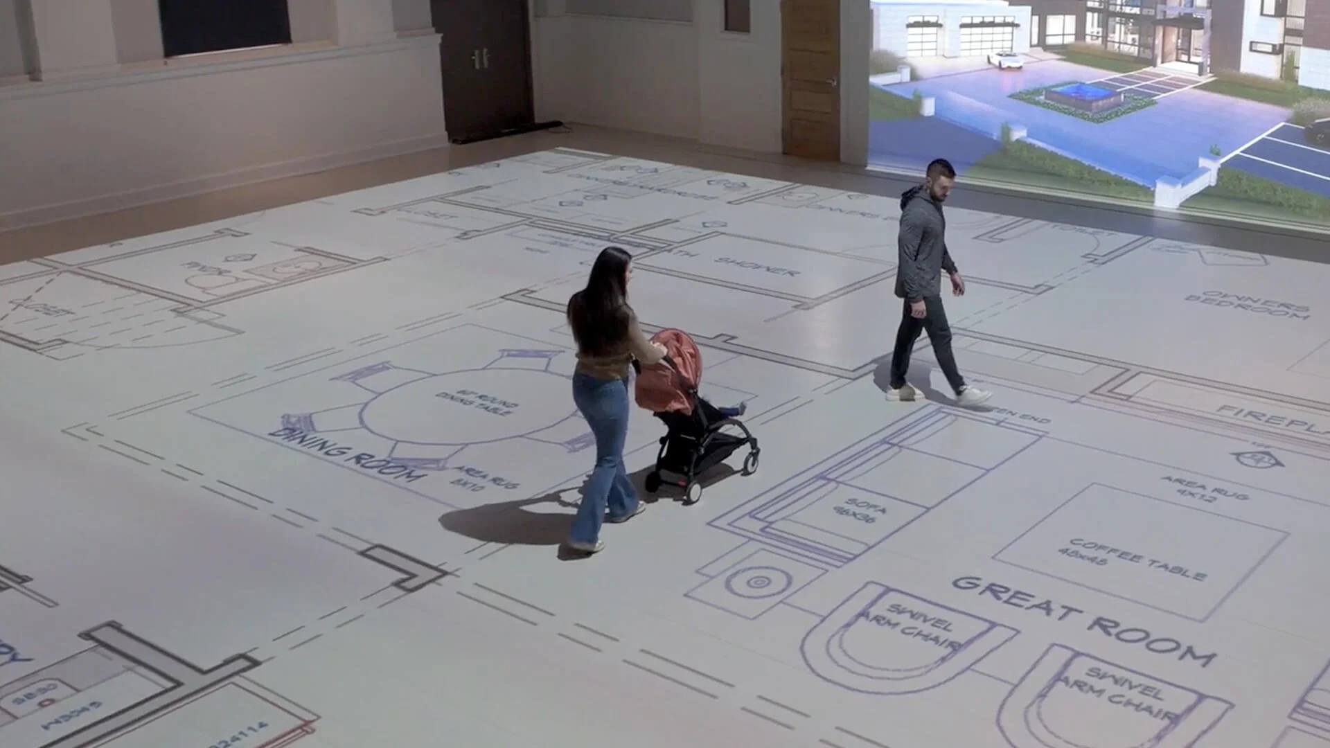
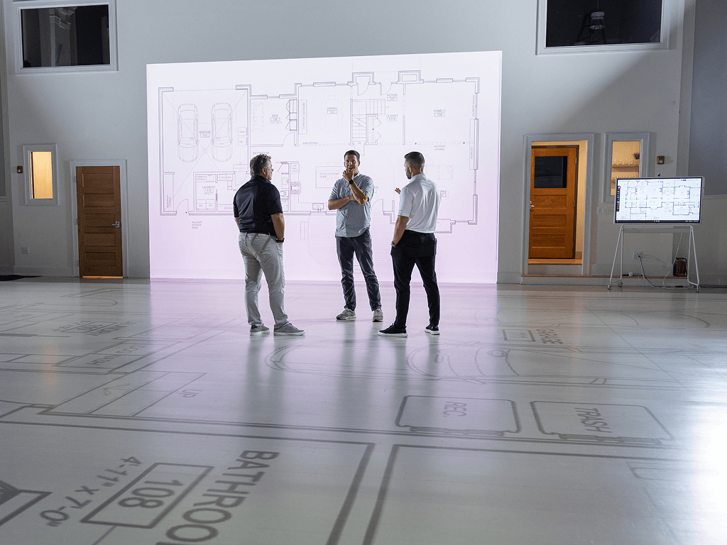
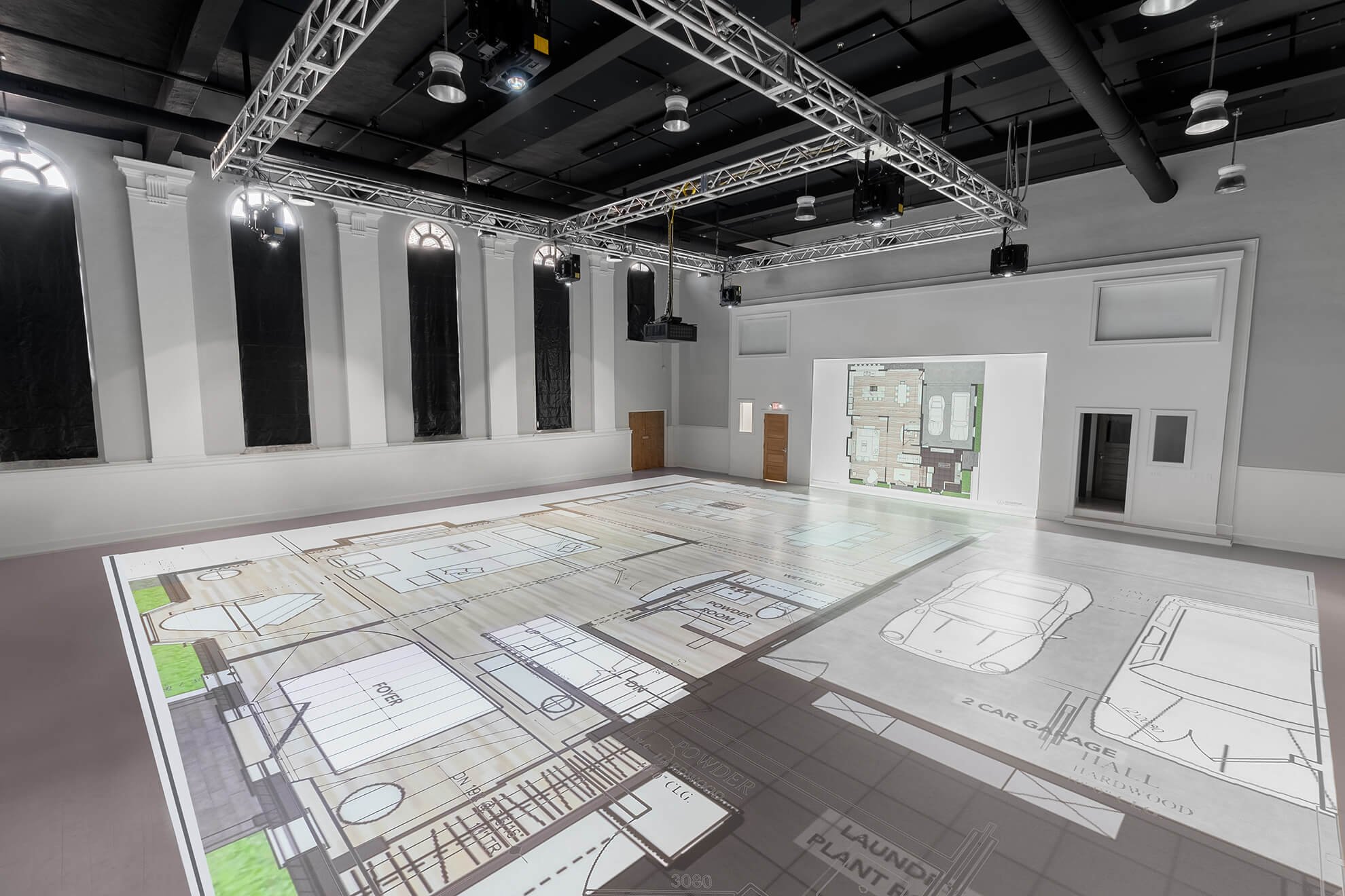
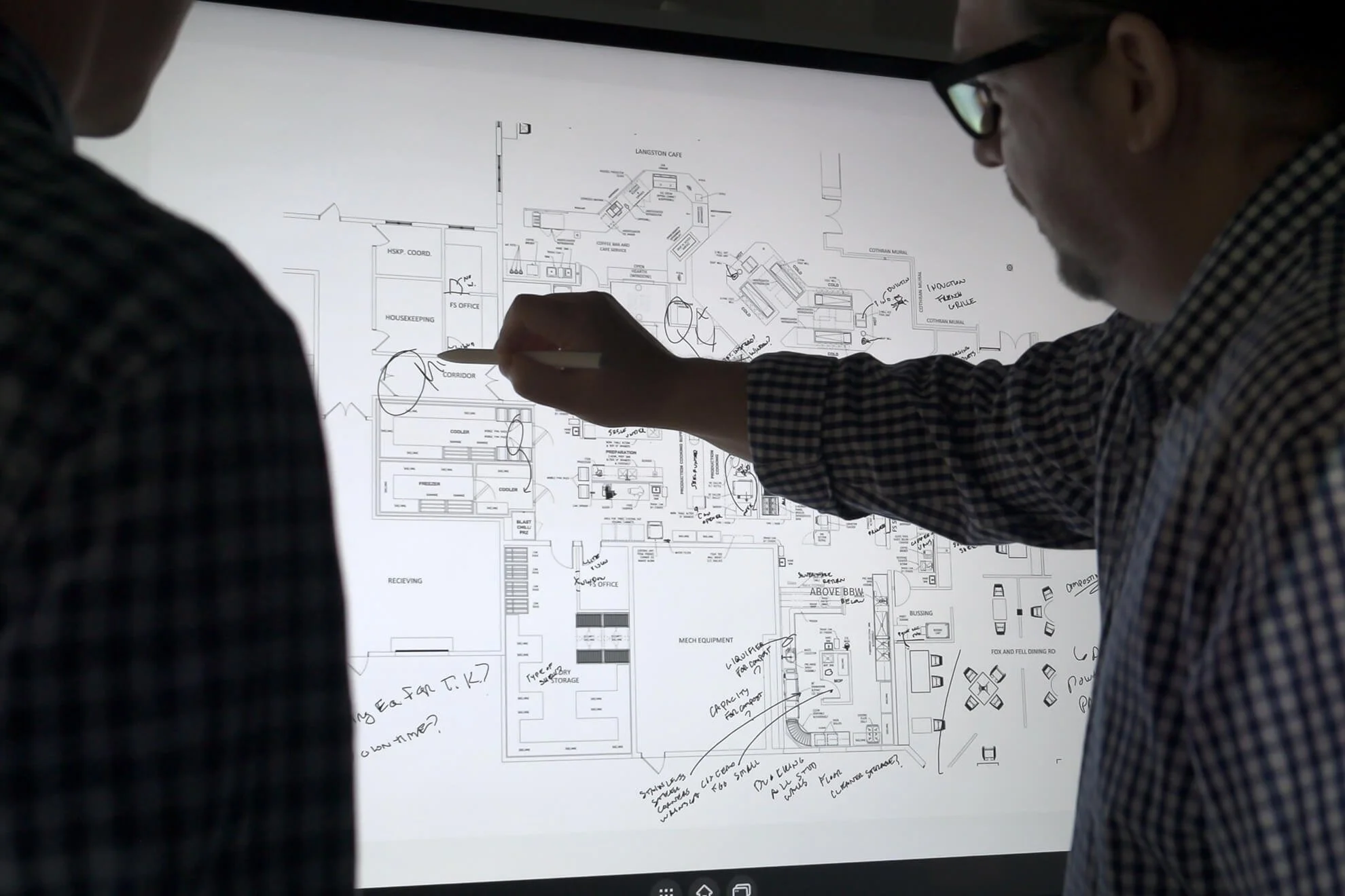
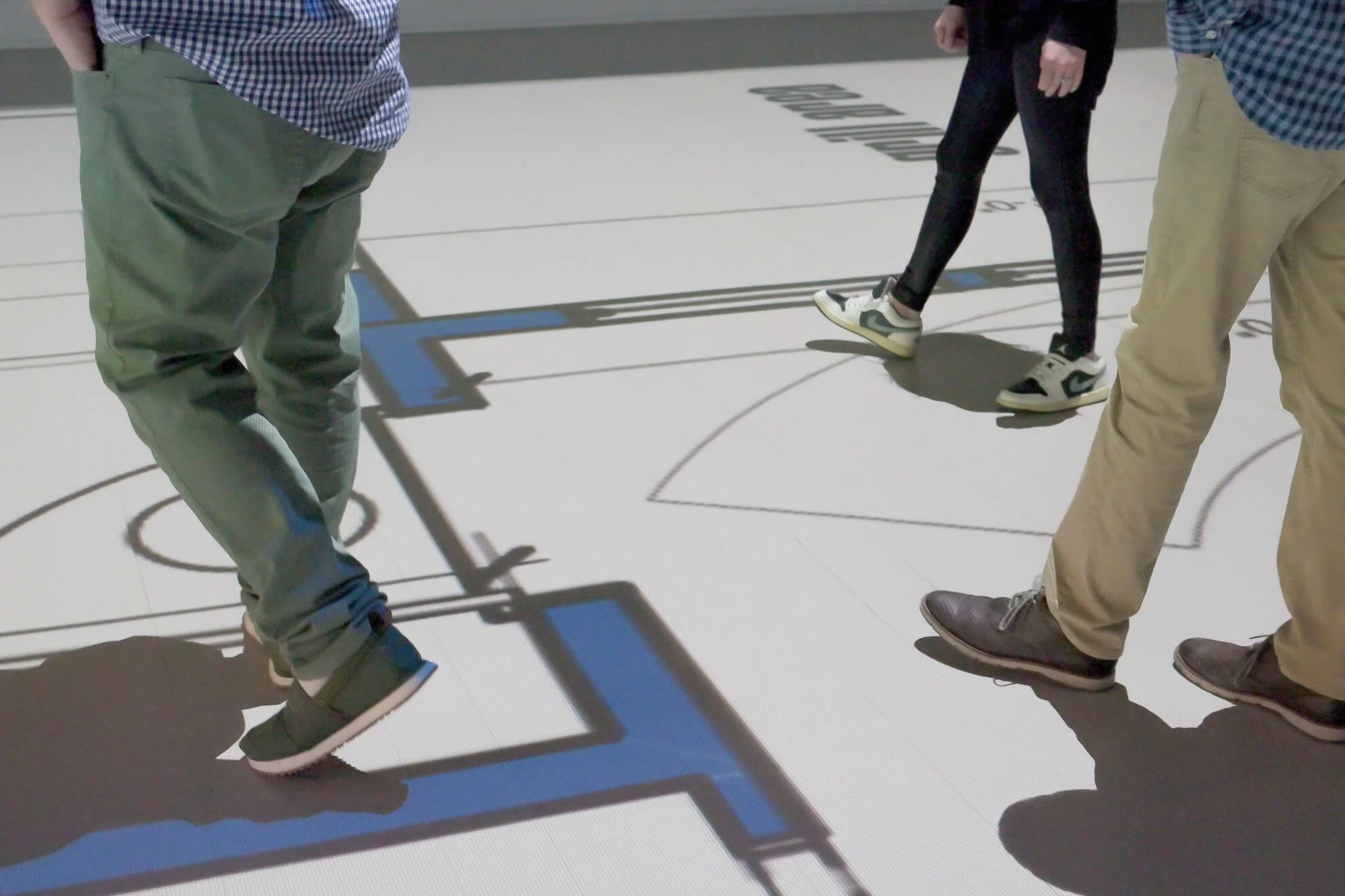
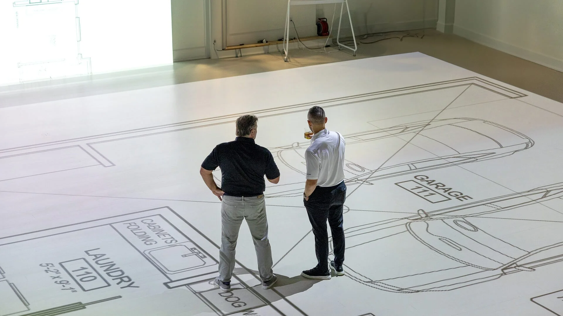
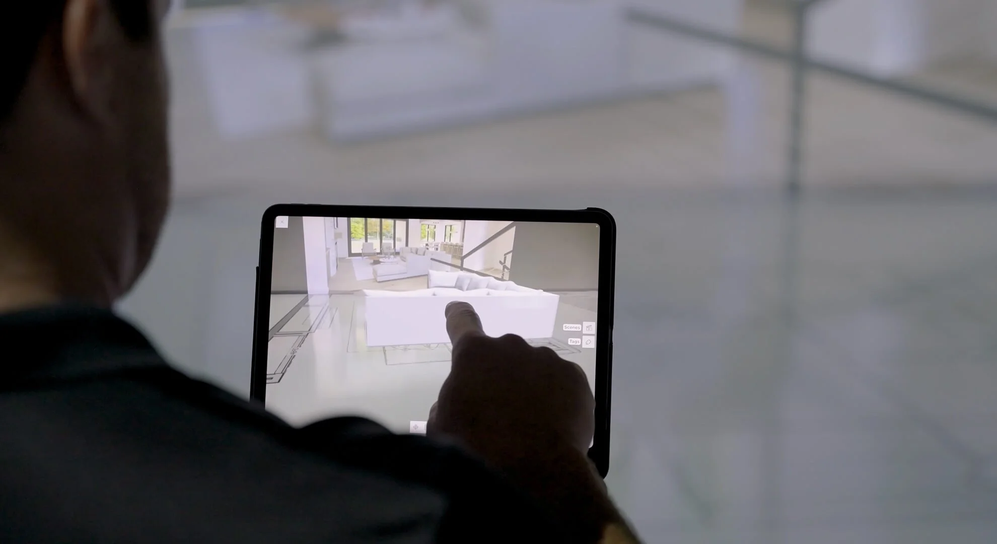
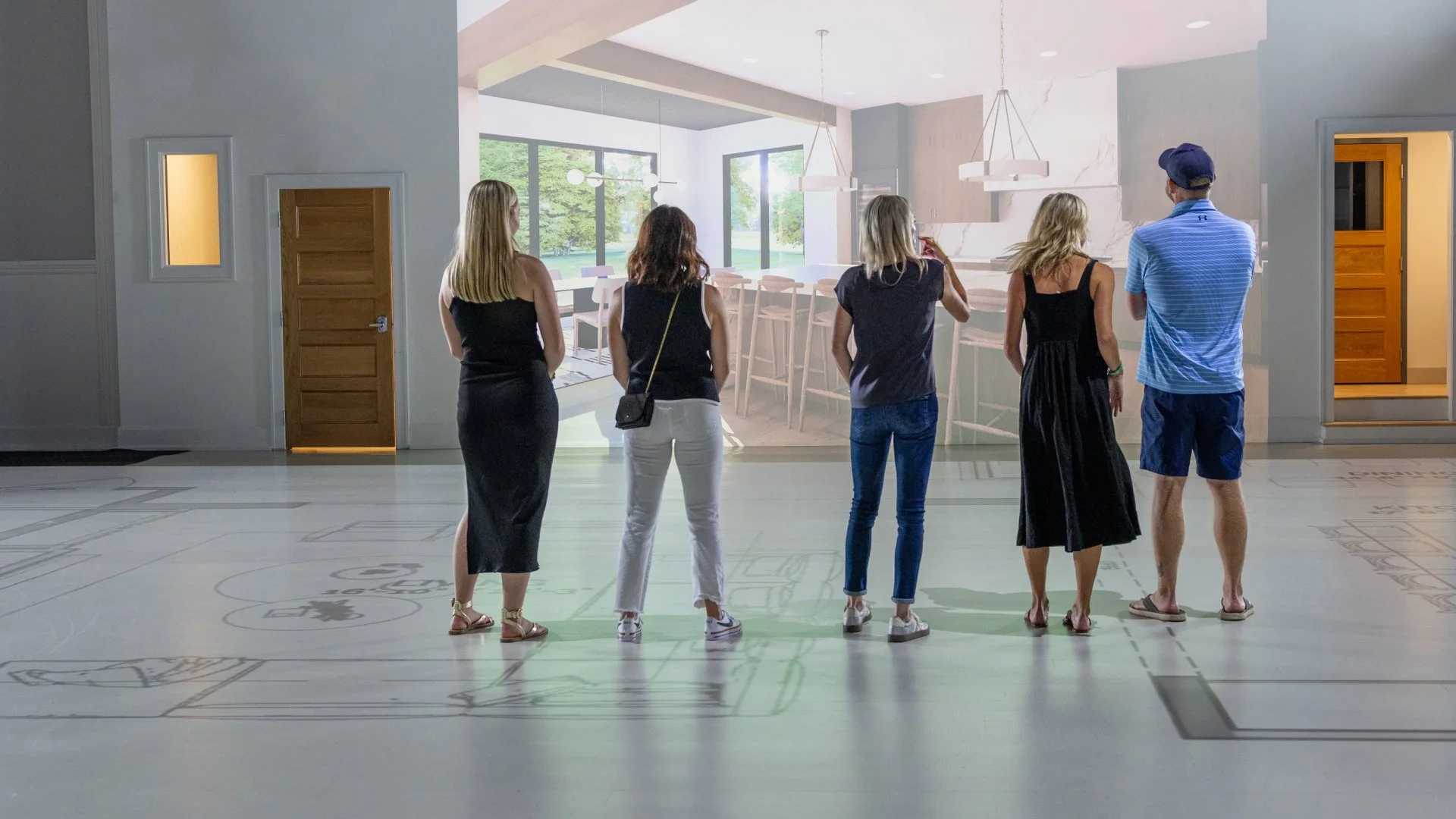
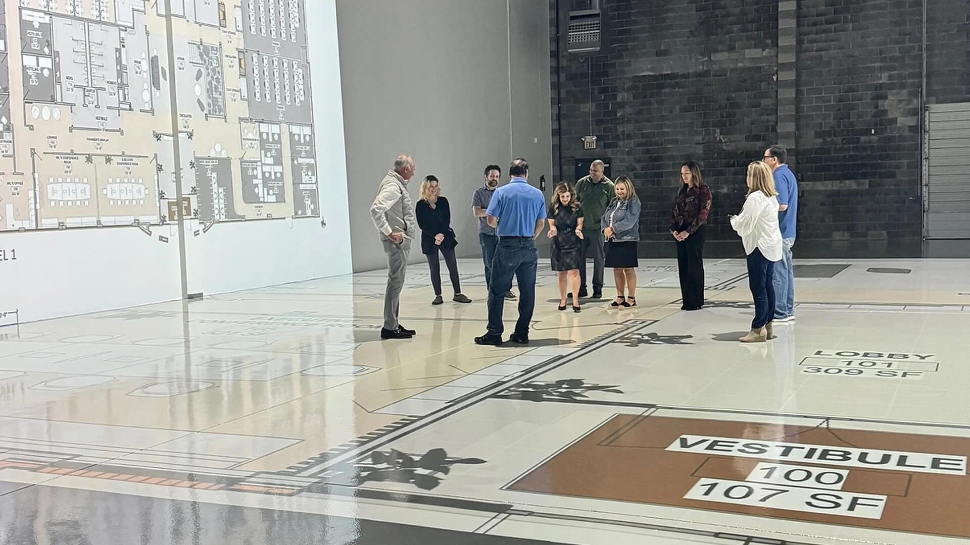
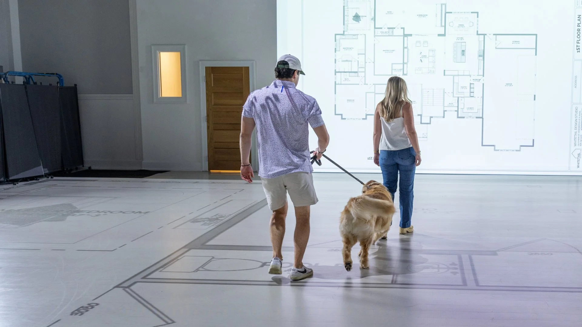
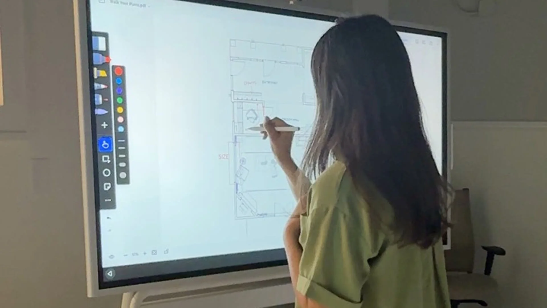
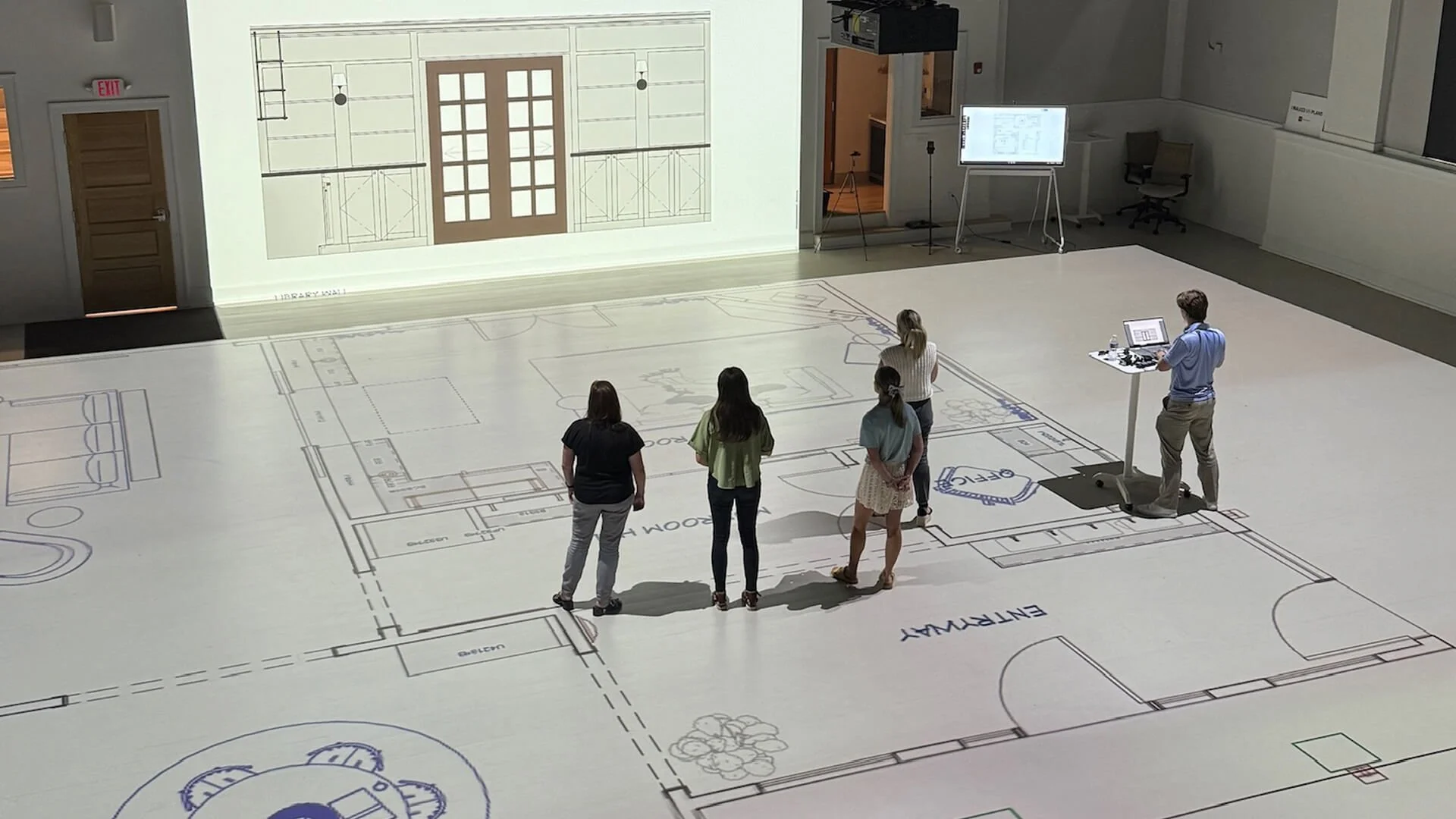
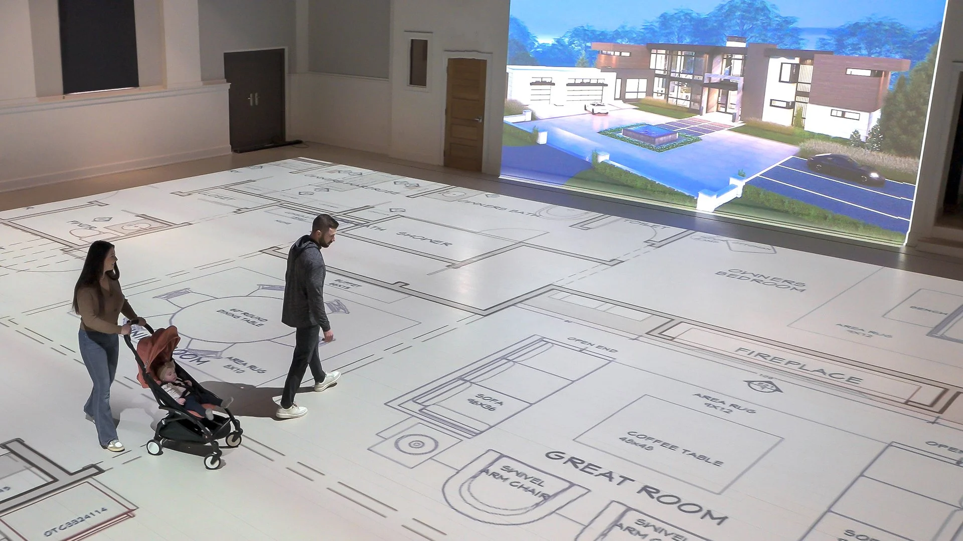
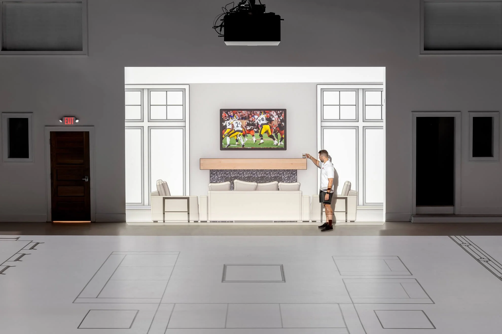
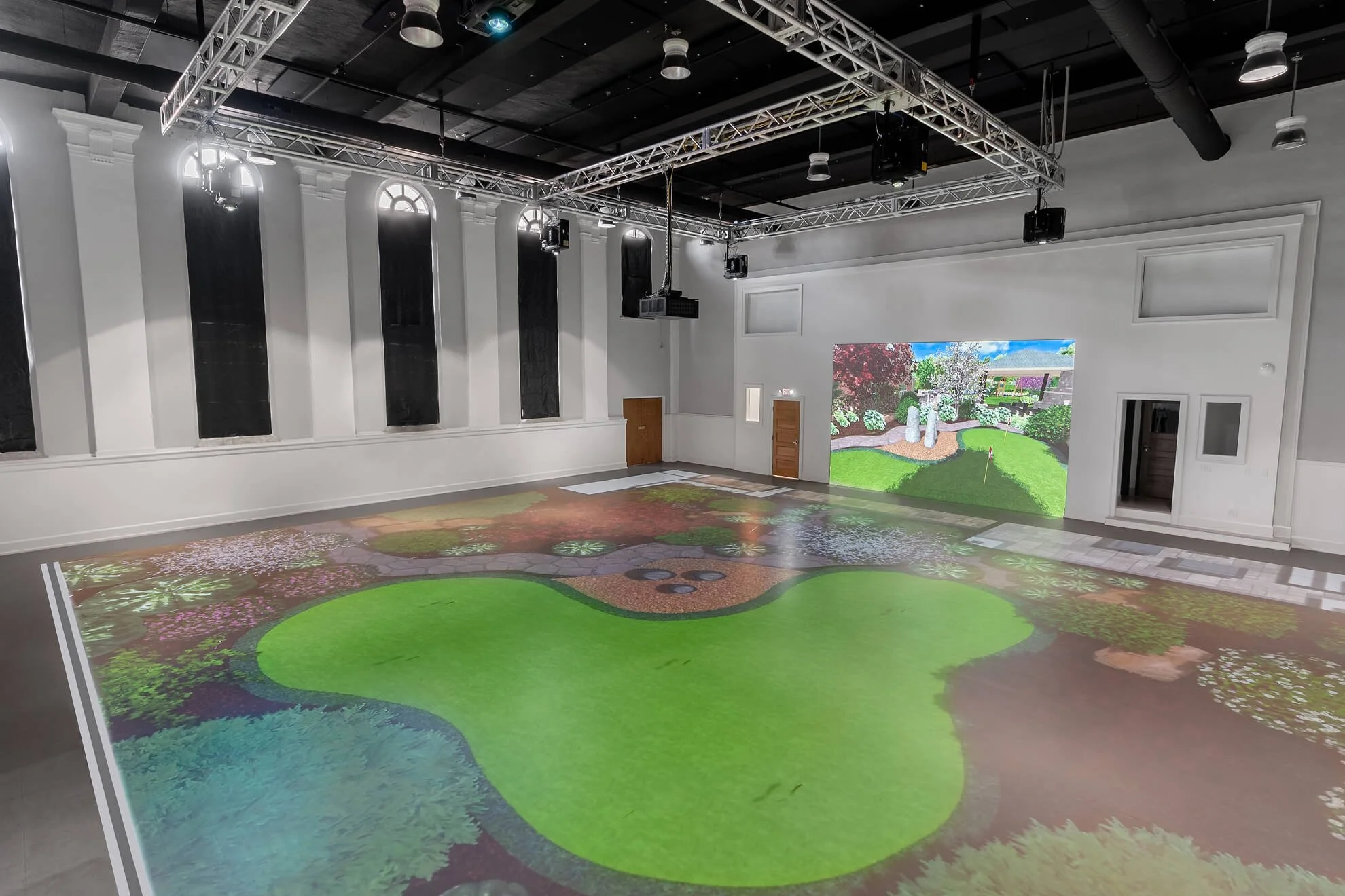
Photography
Our photography reflects the Walk Your Plans experience. From projection facility, to the collaborative immersive experience, each photo dynamically displays what makes Walk Your Plans the best in its space. The tone of every photo follows the hallmarks of our brand personality while connecting with each of our audiences. Licensees are welcome to share their best professional photos to help show off our national appeal, our amazing professionals, and our continuity of brand.

Need Help?
For more information or to request assets not available on this guide, contact:

Alana Coticchia
Director of Marketing
(440) 554-0488
alana@walkyourplans.com
All images, copy, art and graphics shared on this site are property of Walk Your Plans and our Licensees. ©WalkYourPlans 2026